
Key takeaways
- Kelvin sets the mood; CRI sets the truth — color temperature decides whether light looks warm or cool, but color rendering decides whether a tomato looks like a tomato.
- Cool light above ~4500K renders most food and warm packaging badly — it flattens reds and browns toward gray, which is why raw meat and baked goods look unappetizing under it.
- A high overall CRI can still hide poor red rendering — CRI averages pastel samples and skips saturated red, so check R9 specifically if food color matters to you.
- Mismatched color temperatures across a kitchen read as a fault, not a feature — a 2700K shelf beside a 4000K one makes the warmer one look dingy and the cooler one look clinical.
- For label legibility, contrast and CRI beat raw brightness — a moderately bright, high-CRI, neutral-warm light makes small print readable in a way a dim warm bulb or a harsh cool one does not.
What's in this guide
- The short verdict
- What Kelvin actually measures
- Why cool light makes food look wrong
- CRI: the number that matters more than Kelvin
- The R9 trap: high CRI that still kills reds
- Matching color across the kitchen
- The label-legibility case, specifically
- Side-by-side comparison
- What to look at
- Common questions
The short verdict
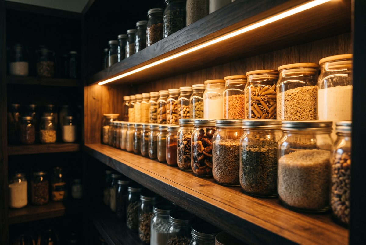
For most pantries, 3000K with a high CRI is the safe default — warm enough to render food and packaging naturally, neutral enough to read labels without squinting. Go to 3500K–4000K only if your pantry doubles as a workspace and you want crisper contrast, and match whatever you choose to the rest of the kitchen so shelves don't clash. The number that matters most isn't Kelvin at all — it's color rendering. A cheap 3000K strip with poor CRI will make your food look worse than a good 4000K one.
What Kelvin actually measures
Color temperature is measured in kelvin (K), and the scale runs counter to how we talk about 'warm' and 'cool.' Lower numbers look warmer and more orange; higher numbers look cooler and bluer. The scale comes from physics: it describes the color a theoretical black body glows as you heat it, so a candle-like glow sits low and a daylight-blue sky sits high. Confusingly, the lower, 'warmer' end is the cooler temperature in actual degrees — the naming follows appearance, not thermometer readings.
In practical terms: 2700K is the soft, yellowish glow of a traditional incandescent bulb. 3000K is a warm white, still cozy but with a touch more clarity. 3500K is a genuine neutral. 4000K reads as a crisp, slightly cool white. 5000K and up is 'daylight,' distinctly blue-white and often described as clinical indoors. None of these is correct in the abstract — the right one depends on the room and the task.
For a pantry, the task is twofold: seeing the food and packaging accurately, and reading labels. Those pull gently in different directions. Warmer light flatters food; cooler light sharpens fine print. The sweet spot for most people lands around 3000K, warm enough to keep food looking right while staying clear enough to read by. We'll build the case for that below, but the headline is that Kelvin is only half the story — and, as the next sections argue, arguably the less important half.
Why cool light makes food look wrong
Step into a pantry lit at 5000K and the food looks subtly off — meats grayer, bread paler, warm-toned packaging drained of its richness. This isn't imagination. Cool, blue-heavy light has relatively little energy in the warm end of the spectrum, so the reds, oranges, and browns that dominate food and much food packaging have less light to reflect back. The result skews everything toward a flat, grayish cast.
Warm light does the opposite. At 2700K–3000K the spectrum is rich in exactly the wavelengths that food reflects, so reds look red and browns look appetizing rather than muddy. This is a large part of why restaurants and delis light their food warm: it isn't only ambiance, it's rendering the product in its best and most accurate light. For a pantry, the same logic applies — you want to judge whether produce is still good, and cool light makes that judgment harder by graying out the very cues you're reading.
There's a limit, though. Push too warm and everything takes on a yellow film that muddies fine color distinctions and makes small print harder to read. That's the argument against defaulting to 2700K everywhere: it's lovely for ambiance and slightly worse for the pantry's actual jobs. The reasoning here is about where a light's energy sits in the spectrum; it's physics, not a product test, and you can confirm it by moving the same item between a warm and a cool lamp.
CRI: the number that matters more than Kelvin
Here's the part most pantry-lighting guides underplay. Two lights can share the exact same 3000K rating and render food completely differently, because Kelvin only describes the color of the light, not how faithfully it reveals the color of objects. That faithfulness is the Color Rendering Index, or CRI, scored out of 100 against natural light. A CRI in the 90s renders colors close to true; down in the 70s or low 80s — common in cheap LEDs — colors visibly shift.
This is why a bargain LED strip can make your pantry look wrong even at a 'correct' Kelvin. The light is nominally warm, but its spectrum is spiky and incomplete, so certain colors have little to reflect and go dull or shift hue. Food is especially unforgiving here because its appeal lives in subtle color: the difference between fresh and past-its-prime is often a small shift that a low-CRI light erases. If you buy on Kelvin alone and ignore CRI, you can do everything 'right' and still hate the result.
The practical rule is to treat CRI as a gate, not a bonus. Aim for 90+ CRI and only then choose your Kelvin. A high-CRI 4000K light will render food more honestly than a low-CRI 3000K one, even though 3000K is the warmer, friendlier number on paper. Manufacturers who care about rendering publish the CRI figure prominently; if a listing hides it, that silence is itself information. This is standard photometric fact rather than a hands-on result.
The R9 trap: high CRI that still kills reds
CRI itself has a blind spot worth understanding, because it explains the maddening case of a light that scores well and still makes meat look gray. Standard CRI — the number usually printed, sometimes written Ra — is an average of eight relatively muted pastel color samples, R1 through R8. It does not include deep saturated red. Because saturated red is one of the hardest colors for ordinary LEDs to produce, a light can post a respectable CRI in the 80s or low 90s while rendering true reds poorly.
That saturated red is measured by a separate value called R9. When R9 is low or even negative, red objects — raw meat, tomatoes, red packaging, and skin tones — look grayed-out, dull, or washed regardless of the headline CRI. This is well documented in lighting-industry material: a lamp can 'pass' on CRI and still fail the red test that matters most for food. It's the technical reason behind the common complaint that beef looks fresh in the store and gray at home under a different light.
For a pantry, R9 matters most if you store and judge fresh produce or meat rather than only shelf-stable boxes and cans. If that's you, look for a light that publishes a positive R9 (ideally 50 or above) in addition to a 90+ CRI. Most listings won't state R9 at all, which unfortunately means the lights engineered for good red rendering are the ones most likely to advertise it — a useful selection signal. We're describing an industry metric here, not reporting our own measurements.
Matching color across the kitchen
A single well-chosen light can still look wrong if it clashes with everything around it, and this is the mistake that turns a good bulb choice into a bad result. Human vision judges color relative to its surroundings, so a 2700K pantry shelf sitting next to a 4000K cabinet run makes the pantry look dingy and yellow while the cabinets look cold and clinical — even though each, alone, might be fine. The eye reads the difference as a defect.
The fix is consistency. Pick one color temperature for the functional lighting across a connected space — under-cabinet, pantry, and task areas — and hold to it. Mixing is defensible only when it's clearly intentional and separated, such as warm 2700K accent lighting in a display area versus neutral 3500K over a work zone, where the eye reads them as different rooms doing different jobs rather than a mismatch. Within one sightline, match.
Two traps make this harder than it sounds. First, 'warm white' and 'soft white' are marketing terms, not exact figures — verify the actual Kelvin number rather than trusting the name, because one brand's 'warm white' may be 2700K and another's 3000K. Second, mixing brands even at the same stated Kelvin can still show a visible difference because their spectra and CRI differ; buying your matched fixtures from one product line reduces that risk. This is a consistency argument grounded in how vision works, offered as reasoning rather than as a tested claim, and it's where we go deeper than guides that stop at 'pick a warm color.'
The label-legibility case, specifically
Reading labels is the pantry job that gets the least attention and arguably drives the decision most, because it's the thing you do every time you open the door. Small print on spice jars, cooking times on boxes, best-by dates stamped in low-contrast ink — all of it depends on light, and the right light here is not simply the brightest.
Three factors decide legibility. Contrast comes first: text is easier to read when the light reveals the difference between ink and background, which a high-CRI light does better because it renders both truly instead of muddying them. Color temperature comes second and pulls slightly cooler than the food-flattering ideal: a neutral-warm light around 3000K–3500K gives crisper edges to fine print than a very warm 2700K, whose yellow cast softens contrast. Brightness comes third — enough to see by, but past a point more brightness just adds glare off glossy packaging without helping you read.
This is why 3000K with high CRI is such a defensible pantry default: it's the compromise that keeps food looking honest while staying legible. If your pantry is mostly labels and shelf-stable goods rather than fresh food, nudging to 3500K is reasonable for the extra print clarity. The point competitors miss is that the label-reading task, not the ambiance, is what a pantry light is really for — and it rewards CRI and contrast over both warmth and raw output. This section reasons from how contrast and legibility work; it isn't a measured study.
Side-by-side comparison
| Kelvin | Looks like | Renders food | Best pantry use |
|---|---|---|---|
| 2700K | Warm, yellow (incandescent) | Very flattering, can muddy fine print | Ambiance; display niches |
| 3000K | Warm white | Flattering and still clear | Recommended default for most pantries |
| 3500K | Neutral white | Accurate, slightly crisper | Pantry doubling as a workspace |
| 4000K | Crisp, slightly cool | Reds start to flatten | Task-heavy spaces; only if matched kitchen-wide |
| 5000K+ | Blue-white daylight | Poor; grays out reds and browns | Generally avoid for food storage |
What to look at
Check current specifications and reviews yourself before buying — product lines change.
Pick a 3000K light with a stated 90+ CRI
3000K keeps food and warm-toned packaging looking natural while staying clear enough to read labels, and a 90+ CRI ensures the rendering is honest rather than shifted. Reasoning from photometric fact, this pairing solves the pantry's two real jobs at once for most users.
Retail links added after affiliate approvalNo purchase link is active. Compare current specifications and retailers independently.
Prioritize a light that publishes a positive R9
Standard CRI can look good while still rendering saturated red poorly, and red is exactly the cue you read to judge freshness. A published, positive R9 is the selection signal that the light was engineered for the reds that matter, per lighting-industry documentation rather than our own testing.
Retail links added after affiliate approvalNo purchase link is active. Compare current specifications and retailers independently.
Buy your matched lights from one product line
Even at an identical stated Kelvin, different brands can differ visibly because their spectra and CRI diverge. Sourcing from a single line reduces mismatch, so one shelf doesn't read green or dingy next to another — a consistency point grounded in how vision judges color relative to its surroundings.
Retail links added after affiliate approvalNo purchase link is active. Compare current specifications and retailers independently.
Common questions
Have you tested these yourself?
No. The Lit Shelf does not own or operate the lights discussed, and nothing here reports our own measurements. The Kelvin appearances, the CRI and R9 explanations, and the food-rendering effects are drawn from standard photometric references and lighting-industry documentation.
Where a recommendation is our reasoning — such as the 3000K default or the consistency-across-fixtures argument — we flag it as reasoning in the text so you can separate sourced facts from our judgment and verify it in your own space.
Is warmer or cooler light better for a pantry?
Warmer light, up to a point. Around 3000K renders food and packaging accurately while staying legible, which suits the pantry's real jobs. Cool light above roughly 4500K grays out reds and browns and makes food look worse.
The exception is a pantry that doubles as a workspace, where 3500K adds a little print clarity. Below 2700K the yellow cast starts to soften contrast and make small labels harder to read, so very warm isn't automatically better either.
What CRI should I look for?
Aim for 90 or higher, and treat it as a requirement you check before you even pick a color temperature. Below the mid-80s, colors visibly shift and food can look dull or off even at a correct Kelvin.
If you store fresh produce or meat, also look for a published R9 of about 50 or above. Standard CRI skips saturated red, so a light can score well overall and still make red items look gray without a decent R9.
Why do my shelves look like different colors from each other?
Almost always because the fixtures don't match. Two lights at different Kelvin values in the same sightline make the warmer one look dingy and the cooler one look clinical, since the eye judges color by comparison.
Even lights at the same stated Kelvin can differ if they're from different brands, because their spectra and CRI diverge. The fix is to use one color temperature across connected areas and, where you can, source matched fixtures from a single product line.
Evidence & limitations
Sources used for this guide
- U.S. Department of Energy: LED Basics — Primary background for CCT, color fidelity, and CRI.
- ENERGY STAR: Downlight criteria — Kelvin and color-rendering definitions.
How to read this: Manufacturer pages support product specifications; institutional sources support the cited guidance. Our comparisons and recommendations are editorial analysis, not laboratory testing.
Measure before you shop
Use the free printable shelf checklist—no email required.